Die Tage werden so langsam ruhiger, und ich habe endlich Zeit, einige meiner Twitter-Lesezeichen und Pocket-Ablagen durchzugehen (ähnlich wie meine Fitnessstudio-Mitgliedschaft habe ich tausend Bookmarking-Tools, gucke aber nie rein). Nun aber doch, und ich möchte euch ein Schmankerl weiterempfehlen, das ich ganz besonders toll fand:
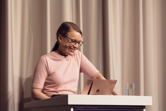
Meine ehemalige Kollegin und Freundin Sonja Knecht, mit der ich bei Edenspiekermann zusammengearbeitet habe, hat auf der diesjährigen (letzten) TYPO Konferenz einen hervorragenden Vortrag mit dem noch viel hervorragenderen Titel »Text–Sex–Scheiße« vorgetragen.
In knapp 45 Minuten exploriert sie unter anderem tausend weitere mögliche Titel-Ideen des Vortrags; sie rauscht über Kafka und seine Handschrift hin zu Sexismus im Stadtbild, Sexismus in der Sprache und daraus folgend auch sexistische Kackscheiße und merkt an, dass selbige erschreckender Weise noch nicht im Duden zu finden ist. Als Quintessenz bündelt sie, was wir, die gerne schreiben, schon lange ahnten: Text ist gestaltete Sprache, Wörter sind eine mächtige Waffe.
“Forget Coding: Writing Is Design’s Unicorn Skill.”
— John Maeda
Sonja ist, neben ihrer hervorragenden Qualitäten als Mensch und Texterin, auch eine geistreiche und unterhaltsame Sprecherin, und bevor ich hier aus dem Lobhudeln und den vielen Adjektiven gar nicht mehr herauskomme:
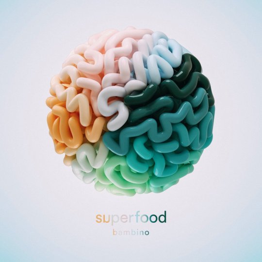
Seit einigen Wochen bin ich besessen von einem Track der Band Superfood, der in meiner Spotify Weekly Playlist landete, und der die berechtigte Frage stellt: Where’s The Bass Amp?
Wie immer bin ich viel zu spät dran; ein Jahr, um genau zu sein, denn im September 2017 erschien schon das zweite Album der Band, betitelt: bambino. Meine Lieblingstracks sind besagter Bass Amp und Double Dutch, aber auch der Rest des Albums katapultiert bequem zurück in Indie-Pop-Zeiten, in denen wir noch Blogposts über Musik geschrieben haben. Link zu Spotify und Apple Music.
My first mobile phone was a Philips Savy Vogue. It had a one-line display and its most special feature was the horoscope program that would calculate your daily scores regarding love, friendship, energy and so on.
I think that mobile phones, even before Apple’s product designs from the early 2000s, got me into design. I was such a nerd I would rebuilt iconic phones with FIMO modeling clay; studying folding mechanisms in flip phones and exploring keyboard layouts. It’s a really odd thing to do as an 10-year-old child, and my parents must have thought that I was crazy.
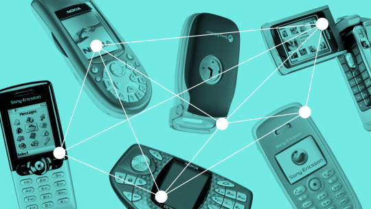
Here are the six phones I found most fascinating as a kid:
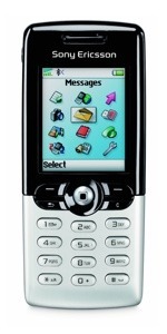
Sony Ericsson T610
Released in 2003, the T610 impressed me because of its simplicity. While all other phones from that decade either looked like toys or like fax machines, the T610 was elegant, with a glossy black top and polished aluminium bottom. The joystick was horrible, obviously. It does have some form factor familiarities the first iPhone, released in 2007.
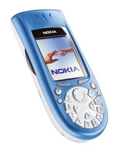
Nokia 3650
When it comes to ugliness, this is my absolute favorite! I never owned one of these, but their design was mesmerizing, even from afar. Who would want to use a circular keyboard?! In general, Nokia was the king of odd phone designs in the 00s—here is a neat collection of them.
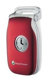
Sony Ericsson Z200
I was always fascinated by flip phones, as their product design included another layer of privacy, sound design (that noise when furiously closing the device after an emotionally stirring phone call!) and general mysticism. Back then, everything was allowed—so why not combine an analog watch into a smooth clamshell design, and add a little handle on top?! So classy.
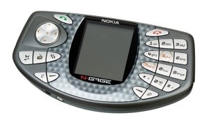
Nokia NGage
My class-mate had one of those, and they were the oddest piece of technology. Almost as if someone designed a device that wanted to prevent you from calling someone, you had to hold it sideways to your ear to hear anything. With its ridiculous price, it wasn’t able to compete with mobile game consoles back then. But with the horizontal keyboard, it paved the way for mobile computing that later became popular with the Hiptop/Sidekick.
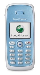
Sony Ericsson T300
One of the phones I admired and actually could afford. It wasn’t a technical revolution; it even didn’t have an integrated camera but only a clip-on device (so awkward!). But I loved the design; the glossy, flat front layer and the soft, matte off-white back. There were no annoying edges, bumps, notches. It felt as if it was made from one piece.
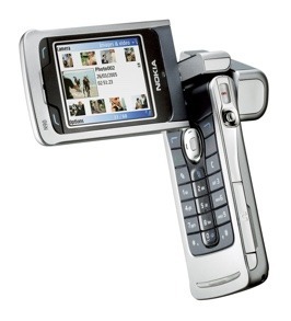
Nokia N90
The N90 looked like a camcorder, but more fragile and less powerful. YouTube was only founded two months before the phone was released (February 2005), so there was not really a place to share all those videos. It’s funny how the camera only had two megapixels, but they still decided for a full-fledged camcorder design.
From all the regular cell phones I owned, I can hardly remember any interfaces (except the one from the Nokia 3310). UI design was nothing spectacular back then—the hardware was the most exciting part. That changed completely: Smartphones are, by now, only a slim layer of glas or plastic, and the UI defines the experience. I wouldn’t mind today’s devices to become a bit more visible again—if it isn’t possible to make them fully invisible.
Within the past semester, we had a seminar at University about the establishment of the personal computer (briefly mentioned in one of my newsletters). From a historical and media-theoretical point of view, we read and discussed essays and papers from engineers, philosophers and researchers from the 1960s to the late 1990s.
I loved the seminar, because I finally found the time to read stuff by really important people who paved to way to modern-day computer interaction—people like Ada Lovelace, Alan Kay, Adele Goldberg, and (my favorite!) Howard Rheingold. His very well-written book “Tools for Thought” is available online, and guides perfectly through the history of computers as tools.
During our semester break, I wrote an essay about one thing I found particularly interesting: The computer’s form and shape—and how it was always designed to disappear. With current technology trends like voice input and wearable tech, its starting to actually do so. You can read the text ( a slightly simplified version) in English or German. I’d love your feedback, too!
The everyday in itself is quite dull. But creative people tend to give the everyday a lift, a surprise or a smile. They add something new to it. I like that. It is like a white sheet of paper for an artist. I use the everyday as a challenge for me to give it something more interesting. The everyday world is my canvas. I think it is very difficult to be creative when you’re in a really crazy environment. It is a bit like me if I go to a party: when there are lots of loud people, I go quiet. Because I don’t want to compete. And it’s the same thing with design. The context I work in starts quiet.
For this year’s TYPO conference, David Reitenbach and me sat down with speaker Dominic Wilcox to discuss some thoughts from his talk and some more general questions regarding the life as an inventor.
I’ve been a fan of his work since a friend gave me his book “Variations on Normal”, with the comment that “this guy is just as odd as you are”. Don’t forget to check out Dominic’s portfolio full of crazy, funny and light-hearted inventions.
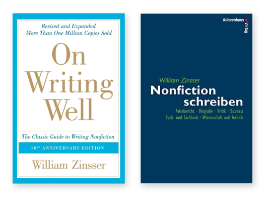
Ein schönes Beispiel dafür, warum ich etwa 80 Prozent der Bücher des vergangenen Jahres auf englisch gelesen habe: Links im Bild die englische Originalausgabe von William Zinssers “On Writing Well” – rechts daneben die deutsche Fassung des Autorenhaus Verlags.
Zinssers vielfach überarbeiteter Ratgeber rund ums Schreiben hing schon seit Monaten auf auf meiner Amazon-Wunschliste. Die Bestellung der englischen Ausgabe hatte im örtlichen Buchladen eine Lieferzeit von zwei Wochen. Natürlich hätte ich einfach auf ›Bestellen‹ in meiner Jackentasche klicken können – aber man will ja den Einzelhandel unterstützen, und so bestellte ich die deutsche Ausgabe, mit dem tristesten Cover, das man sich vorstellen kann. In dem Buch geht es um Persönlichkeit in der Sprache bei Sachtexten! Dabei ist dem deutschen Autorenhaus Verlag wohl die Persönlichkeit der Umschlaggestaltung abhanden gekommen.
A book I always like to give away as a present is Miranda July’s first collection of short stories, “No one belongs here more than you”. They are all brilliant, weird, and heart-shaking in their own way. You can’t really go wrong with it, there is something for everyone in it, and it always tells you something new.
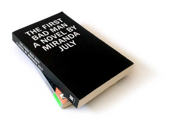
With July’s first novel, “The First Bad Man”, it’s a little different. Even though it says on the back cover that I need to buy this twice and give one to a friend, I hesitated to do so. Don’t get me wrong: I enjoyed reading it, and there were many scenes and ideas I really liked: The Globus Hystericus for example, which appears to be the narrator’s main concern at first. Her visits to the doctor weave a beautiful and sad connection between the characters, and strain a golden thread throughout the book. Miranda July has great talent to subtly create scenes and spaces—I immediately felt as a neighbor or observer, hanging around somewhere in the vast, sunny and empty streets of Los Angeles. In a way, the whole story felt a bit like a rumor being spread in the neighborhood—a rumor about this really strange person and her gardener, a story about violence, unrequited love and parenthood.
Before thinking about giving this novel away as a present, I do recommend to read it for yourself first. It’s not for everyone. Also: The german title is “Der erste fiese Typ”, and this just sounds so wrong and absolutely not how Miranda July would speak; you should read it in english if you can.
For the book launch, Miranda created an online store where she sold artefacts that make an appearance in the book. A broken vase, a long dress with many buttons, a spoon or an old envelope—by now it’s all sold. July always adds a layer to everything. I still love that about her.