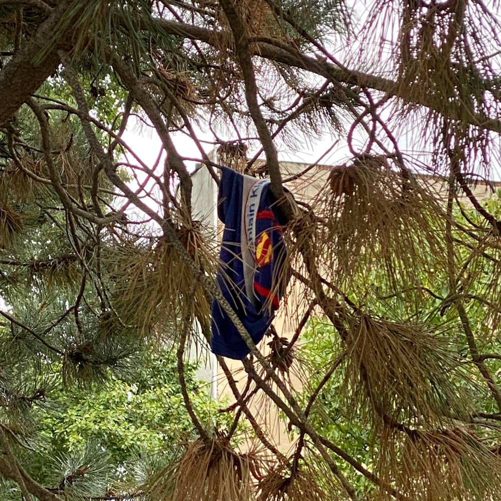
Zwischen den Jahren

Einer der besten Momente zwischen den Jahren war der, in dem mein Vater und ich die hohen Gräser im Garten winterfest gemacht haben. Mit einer Schnur haben wir die kindsgroßen Büsche festgezurrt, damit sie dem Wind stand halten können. Dabei habe ich die Pflanze umarmt und zusammengehalten, während mein Vater mit seiner speziellen Knot- und Wickeltechnik den Garn drumrum geschnürt hat. Nun stehen im Garten meiner Eltern witzige, puschelige Palmen, die den Winter hoffentlich überstehen.

The 00s called and want their mobile phones back!

cellphone collage

My first mobile phone was a Philips Savy Vogue. It had a one-line display and its most special feature was the horoscope program that would calculate your daily scores regarding love, friendship, energy and so on.

I think that mobile phones, even before Apple’s product designs from the early 2000s, got me into design. I was such a nerd I would rebuilt iconic phones with FIMO modeling clay; studying folding mechanisms in flip phones and exploring keyboard layouts. It’s a really odd thing to do as an 10-year-old child, and my parents must have thought that I was crazy.

Here are the six phones I found most fascinating as a kid:

Sony Ericsson T610

Sony Ericsson T610

Released in 2003, the T610 impressed me because of its simplicity. While all other phones from that decade either looked like toys or like fax machines, the T610 was elegant, with a glossy black top and polished aluminium bottom. The joystick was horrible, obviously. It does have some form factor familiarities the first iPhone, released in 2007.

Nokia 3650

Nokia 3650

When it comes to ugliness, this is my absolute favorite! I never owned one of these, but their design was mesmerizing, even from afar. Who would want to use a circular keyboard?! In general, Nokia was the king of odd phone designs in the 00s—here is a neat collection of them.

Sony Ericcson Z200

Sony Ericsson Z200

I was always fascinated by flip phones, as their product design included another layer of privacy, sound design (that noise when furiously closing the device after an emotionally stirring phone call!) and general mysticism. Back then, everything was allowed—so why not combine an analog watch into a smooth clamshell design, and add a little handle on top?! So classy.

Nokia Ngage

Nokia NGage

My class-mate had one of those, and they were the oddest piece of technology. Almost as if someone designed a device that wanted to prevent you from calling someone, you had to hold it sideways to your ear to hear anything. With its ridiculous price, it wasn’t able to compete with mobile game consoles back then. But with the horizontal keyboard, it paved the way for mobile computing that later became popular with the Hiptop/Sidekick.

Sony Ericsson T300

Sony Ericsson T300

One of the phones I admired and actually could afford. It wasn’t a technical revolution; it even didn’t have an integrated camera but only a clip-on device (so awkward!). But I loved the design; the glossy, flat front layer and the soft, matte off-white back. There were no annoying edges, bumps, notches. It felt as if it was made from one piece.

Nokia N90

Nokia N90

The N90 looked like a camcorder, but more fragile and less powerful. YouTube was only founded two months before the phone was released (February 2005), so there was not really a place to share all those videos. It’s funny how the camera only had two megapixels, but they still decided for a full-fledged camcorder design.

From all the regular cell phones I owned, I can hardly remember any interfaces (except the one from the Nokia 3310). UI design was nothing spectacular back then—the hardware was the most exciting part. That changed completely: Smartphones are, by now, only a slim layer of glas or plastic, and the UI defines the experience. I wouldn’t mind today’s devices to become a bit more visible again—if it isn’t possible to make them fully invisible.

Shape-Changing Computers

Image of a text illustration, reading Invisible Machines

Within the past semester, we had a seminar at University about the establishment of the personal computer (briefly mentioned in one of my newsletters). From a historical and media-theoretical point of view, we read and discussed essays and papers from engineers, philosophers and researchers from the 1960s to the late 1990s.

I loved the seminar, because I finally found the time to read stuff by really important people who paved to way to modern-day computer interaction—people like Ada Lovelace, Alan Kay, Adele Goldberg, and (my favorite!) Howard Rheingold. His very well-written book “Tools for Thought” is available online, and guides perfectly through the history of computers as tools.

During our semester break, I wrote an essay about one thing I found particularly interesting: The computer’s form and shape—and how it was always designed to disappear. With current technology trends like voice input and wearable tech, its starting to actually do so. You can read the text ( a slightly simplified version) in English or German. I’d love your feedback, too!

Read the essay in English

Lieber auf Deutsch lesen

032017: Stay Golden

image

As the sun is making an appearance after a couple of weeks of rain and cold weather here in Berlin, I am sitting on the back seat of the M41 bus line (the only bus line that has its own song). Next to me, a woman—probably in her early sixties—explains to her friend: “For a long time, I was only able to take selfies with this phone, because I didn’t know how to switch the camera around! Yesterday, my daughter explained it to me. Look!” She clumsily points at the camera interface to take a photo of the sun breaking through the dirty windows. It’s autumn, friends! Welcome back to this newsletter.

So many things happened within the last months, and at the same time, nothing exciting happened at all. Life just passed by; I passed through it. The woman’s situation on the bus reminded me of all the bad technology that we’re surrounded with. Like the visit to my parent’s house earlier this month, where my dad has a technology setup I just don’t understand anymore (and therefore hardly can help with tech problems). He switched to an Apple ecosystem a while ago, but the Windows DOS mindset is buried very deeply within his brain and pedantry. Everything could be so easy, but people don’t want things to be easy. (Except that one time, when Microsoft announced a couple of months ago that their infamous MS Paint software would be discontinued—no worries though, it will be around somehow). Sometimes, it’s the dumb and simple things that have a strong cultural and emotional impact.

Speaking of dumb: I watched “The Circle” the other night. To clarify: I haven’t read the book, so I can’t compare the differences there, but even though the movie was fine as a simple piece of entertainment, it had so many flaws within the storyline and the topic in general! I just didn’t believe a word Emma Watson said as her character Mae, and I got tired by the very thin dialogues. Half of the story and all possible twists were left open-ended. There was simply nothing either desirable or dystopian—it was just silly most of the time. The semi-futuristic interfaces looked like they were designed in 2002 (check out this great film on how to depict the internet and messaging in film!). Even to logo of “The Circle” was horribly executed! The one Jessica Hische drew for the book in 2013 was much nicer. To sum it up: I was very glad that in my reality, we already overcame platforms like Facebook and 24/7 oversharing of boring nonsense. The movie’s topic almost became obsolete for me.

Most of the time, at least. I’ve been consuming Instagram excessively during the last months, and experimented with their Story feature a couple of times. What bothers me there: People don’t take the time to actually tell stories. They just use it as a dumpster for candids. If you have recommendations for great Instagram story tellers, ping me! My current favorites are Jürgen Siebert’s “Fontstories”, Kübra’s diary posts and Sophie Passmann’s jabbering.

Some more personal and project-related news: At ZEIT ONLINE, we launched a new digital magazine called “Arbeit”. It’s a platform about our relationship to work and work-life-balance, about changes and chances, and failures, too. I designed the thing (and am still totally in love with Milieu Grotesque’s Patron font family).

I was also working on a book which will go to print later this month—my first assignment as a copywriter, which was exciting and fun. Also, I am still working on a seminar paper, which I’ll publish in a couple of weeks, too. Follow me on Twitter and Instagram to never ever miss out again about my exciting life (spent on my couch for 80 percent of the day).

Ok. So far. Have a great start into autumn, and let’s hope that the sun makes a couple of more appearances before it finally gets grey and cold outside for good. Also: remember to switch your phone’s front camera to the back from time to time, to capture some of the rays and golden leaves. Happy October!

Sign up for these newsletters via mail!

Du kannst jetzt aufgeben

In letzter Zeit wache ich oft mitten in der Nacht auf. Ich bin dann nicht todmüde und sauer, dass ich nicht schlafen kann – so ist das ja manchmal – ich bin einfach nur wach und mache eine Schlafpause. Dann stehe ich auf und tapse durch die dunkle Wohnung, ohne Brille. Alles ist verschwommen und und meine Augen gewöhnen sich nur ganz langsam an die Dunkelheit. Ich manövriere meinen Körper durch die Zimmer, weiche blind den Möbeln aus, deren Position ich kenne – hier drüben steht der Wäscheständer, hier hinten stoße ich mir immer das Schienbein.

Dann genieße ich die Geräusche der Nacht, die durchs geöffnete Wohnzimmerfenster kommen. Die Lastwagen, die über die Sonnenallee rauschen, die Hundebesitzer, die schlaflos um diese Uhrzeit ihre Hunde ausführen. Der Person, die zum dritten Mal bei meinen Nachbarn anruft, will man am liebsten durch die Leitung gut zureden: »Ich hoffe, bei dir ist alles okay, aber du kannst aufgeben. Es ist vier Uhr Nachts, da geht jetzt niemand ran.« Und auch ohne mein Handeln gibt sie irgendwann auf. Dann gehe ich zurück ins Bett, für die zweite Runde Schlaf.

A Summer Wasting

Seven weeks of reading papers
Seven weeks of river walkways
Seven weeks of feeling guilty
Seven weeks of staying up all night

Ich Rasier’ Euch Alle

image

Nun ist es nur noch eine Frage der Zeit, bis eins der großartigsten Graffitis dieser Stadt verschwinden wird. Das Haus am Hermannplatz, Hasenheide 119, gegenüber von „Berlins größtem Bräunungs-Center“ (sic), dessen Schicksal der TIP Berlin schon im vergangenen Jahr portraitiert hat, ist seit Monaten eingerüstet. Laut Morgenpost muss es bald einem Büroturm weichen. Was könnte man auch sonst bauen an einen Platz, der zwei lebhafte, multikulturelle Stadtteile verbindet.

Durch das Baugerüst finden sich zahlreiche Graffitis an der Fassade, aber das Schönste thront seit einigen Jahren ganz oben: »Ich rasier euch alle« steht in Blockbuchstaben auf dem Rooftop über der Hermannstraße. Ich werd’s vermissen. Es scheint fast, als rasiere nun doch die Gentrifizierung uns alle.

Im Neuköllner und bei kreuzberg süd-ost gibt es ältere, bessere Fotos. R.I.P.